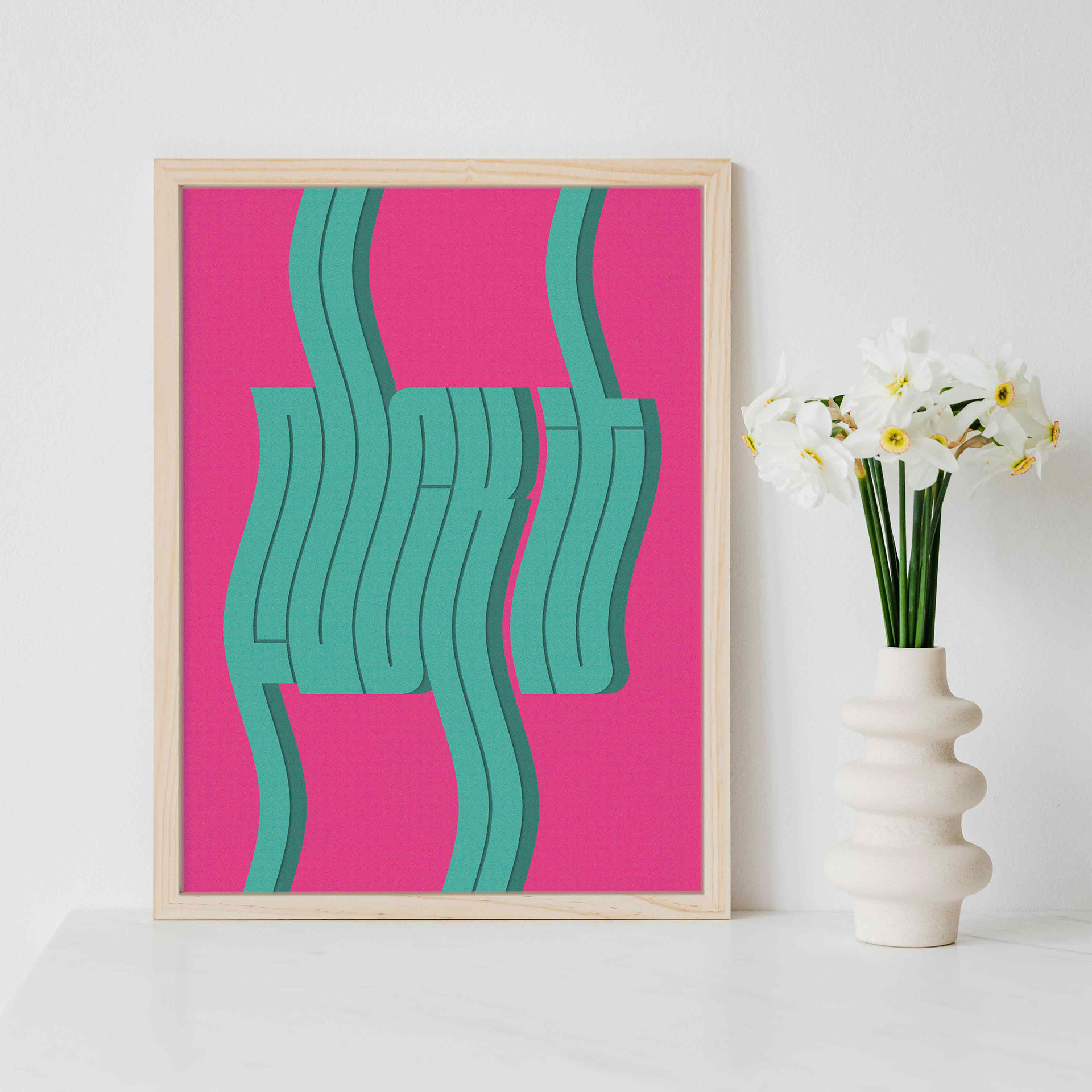
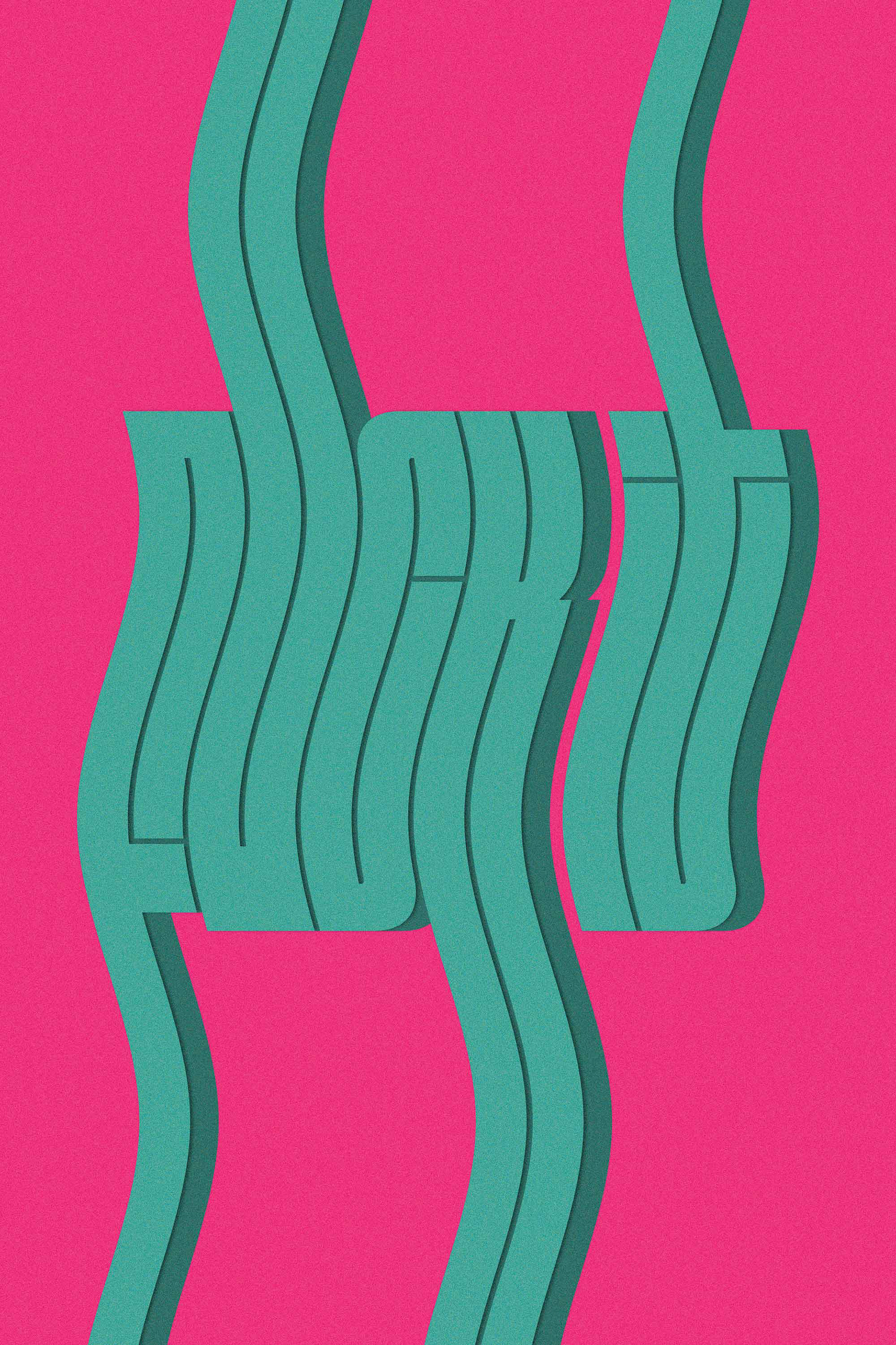
The corky and bright "F*ck It" poster is an experiment in type manipulation. The already heavily stylized "Fit" font from DJR type foundry spells out "F*ck It". The font is further stylized with ascenders and descenders that extend outside the frame, a wave effect from top to bottom, and a drop shadow. The choice for these effects promotes the easy come, easy go nonchalant attitude that often accompanies the saying "F*ck It". Type Manipulation Poster Design